
NOW TRENDING
McLaren New Logo: Inside Its Evolved Brand Identity

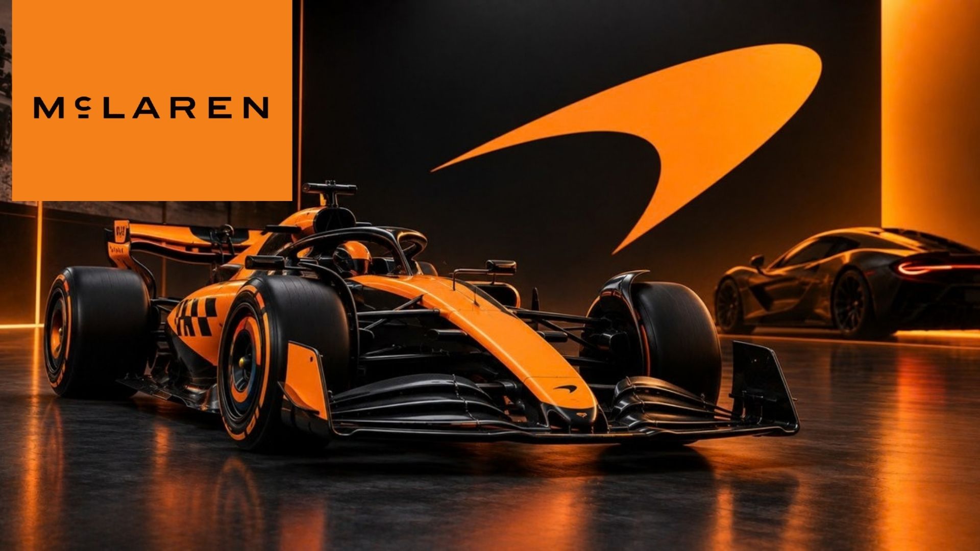
McLaren has revealed an evolved brand identity and a redesigned logo that connects its racing and automotive divisions while returning to key elements of Bruce McLaren’s heritage.
McLaren begins a new chapter with an updated identity
McLaren has unveiled a new brand identity ahead of the 2026 Azerbaijan Grand Prix.
The change brings McLaren Racing and McLaren Automotive closer together under one visual system. The company says the goal is to connect its past, present and future while creating a clearer expression of the McLaren brand.
The announcement was made on September 22, 2026. It comes after more than six decades of development in motorsport and road-car engineering.
The updated identity is built around several familiar symbols. It also introduces a new McLaren wordmark inspired by the company’s early history.
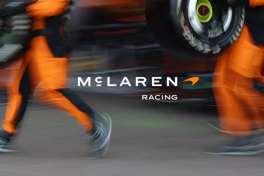
The new McLaren Racing wordmark is part of the brand’s evolved identity unveiled in September 2026.
McLaren says the new identity is inspired by Bruce McLaren’s vision and ambition.
The company also wants the brand to represent more than cars and racing results. Its stated aim is to strengthen the connection with customers, employees, fans and the wider global community.
That approach is especially important because McLaren now operates across several major racing programs.
Its current motorsport portfolio includes Formula 1, IndyCar and the World Endurance Championship, while McLaren Automotive continues to develop high-performance road cars.
The new wordmark looks back to Bruce McLaren
One of the most interesting details is the origin of the new wordmark.
McLaren says it was inspired by the sign above the family service station in Remuera, Auckland, which was owned by Bruce McLaren’s parents, Les and Ruth.
That location has a special place in McLaren history. According to the company, it was where Bruce built the car that later took him to his first racing victory.
The updated design therefore does more than modernize the logo.
It creates a direct visual link between the modern McLaren organization and its New Zealand roots. The company says the new treatment gives those historic elements a stronger visual language for the future.
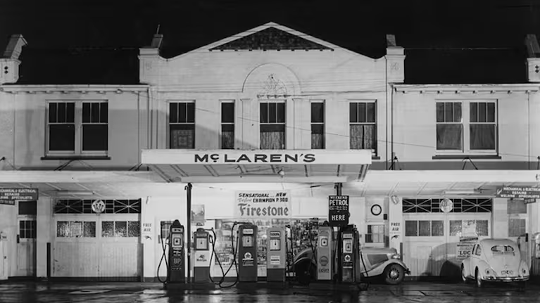
The family service station in Remuera, Auckland, inspired the design of McLaren’s new wordmark.
The move also shows how heavily the identity relies on heritage.
McLaren has spent much of 2026 revisiting important moments from its history. Those projects include a renewed focus on Bruce McLaren and the company’s early work in motorsport and road-car development.
The new logo is the latest expression of that strategy.
The Speedmark and papaya color remain
McLaren is not abandoning its most recognizable symbols.
The Speedmark remains at the heart of the brand. The company says keeping it is important because it represents continuity and remains strongly connected with fans around the world.
The famous papaya color also stays.
However, McLaren is adding a broader color palette inspired by important moments in its history. That gives the company more freedom to adapt the visual identity across different products, racing series and experiences.
The Speedy Kiwi also remains part of the identity.
That symbol pays tribute to Bruce McLaren’s New Zealand heritage. It also preserves a link to one of the earliest visual elements associated with the company.
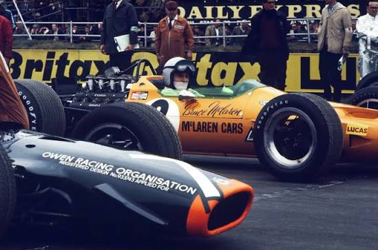
Bruce McLaren’s legacy remains a central part of the brand’s updated identity.
One identity for racing and automotive
The new identity is designed to work across McLaren’s entire organization.
That includes Formula 1, IndyCar, WEC and McLaren Automotive. The idea is to create a more unified visual presence instead of treating each part of the company as a separate brand expression.
The timing is also significant.
McLaren Racing recently marked its 1,000th Formula 1 Grand Prix, while the company has also announced its new WEC Hypercar project. At the same time, McLaren Automotive is expanding its UK manufacturing and engineering operations through a reported £500 million investment program.
These projects all point in the same direction.
McLaren is expanding its presence while trying to keep its historic identity recognizable.
A visual update without abandoning the past
The new McLaren identity is therefore not a complete break from the past.
The Speedmark remains. Papaya remains. The Speedy Kiwi remains. The main change is the way those elements are brought together with a new wordmark and a broader visual system.
That balance is central to McLaren’s message.
The company wants its new identity to feel modern without losing the stories that made the brand distinctive in the first place. The result is designed to connect its historic racing roots with its growing presence in motorsport, road cars and fan experiences.
The McLaren new logo marks the start of that next chapter, bringing the Racing and Automotive sides of the company under a more unified identity while keeping Bruce McLaren’s heritage at its core.








-
 NOW TRENDING2 months ago
Aston Martin DBX Becomes Harry Da Souza’s Ride in MobLand
-

 TEST DRIVES2 months ago
2026 Maserati GranTurismo Trofeo Review: Miami
-
 INTELLIGENT MOBILITY2 months ago
Tesla Cybercab Navigation Problem Hits Austin Robotaxis
-

 INTELLIGENT MOBILITY2 months ago
Tesla Cybercab Cannot Be Charged at Home—Here’s Why
-
 INTELLIGENT MOBILITY2 months ago
2027 Nissan Rogue Hybrid: e-POWER Comes to America
-

 TEST DRIVES2 months ago
2026 Maserati GranTurismo Coupe
-
 Formula12 months ago
Cadillac F1 2026 Faces an Eight-Race Logistics Challenge
-

 NOW TRENDING2 months ago
2027 Lexus LS Gets Another Update, But Not in America